I’ve entered the ITU data on mobile phone penetration for all countries from 1998-2008 into a Google Docs spreadsheet, and then added the Motion Chart visualiser (the same engine made famous by Hans Rosling and TED, though they use the Gapminder Trendalyzer version).
Unfortunately, WordPress scripting rules mean I can’t post the active chart here. To access the spreadsheet data and Google Motion chart, you need to go to:
http://spreadsheets.google.com/pub?key=tUzZsw5SoG_jXRDl6p8tRCg&single=true&gid=0&output=html
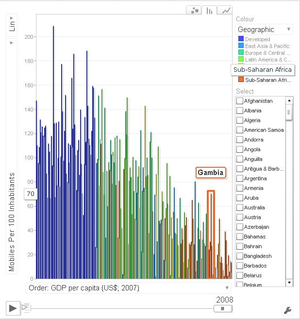
Screenshots below give an indicator of how you can visualise the data. The chart offers three main means to visualise (bubble, bar chart, and line graph) via tabs at the top right. You can change the axes and element colouring/size, and highlight individual countries. For bubble and bar, the main point of the chart is that you can click play (bottom left) and show how things change over time. (Note playback speed variation control, and also the ability to drag over and zoom in on parts of the chart.)


Not sure it adds a lot of analytic value but it’s engaging, helps give a sense of some overall trends, and identifies some interesting outliers. (Some older PCs and low-bandwidth connections will struggle to display.) I’ll repeat for other ITU data in later posts (e.g. broadband data visualisation here). You can find similar visualisation for mobile, Internet and a host of other development data at: http://devdata.worldbank.org/DataVisualizer (though currently up to 2007 only, no obvious access to underlying data, and the mobile data display doesn’t seem to work properly). And, finally, on a separate blog entry you can find a set of rough converters to change mobile phone subscription data to data on ownership, access, use and non-use.
